 Частный репетитор по английскому языку
На оба задания вам даётся 60 минут, первое задание «весит» только треть вашей оценки за письменный экзамен, поэтому обычно не рекомендуется тратить на него больше 20 минут.
Время ваше, поэтому, если хотите, можете начинать с задания 2, можете с задания 1, можете разбивать время поровну, однако я бы ориентировался на идею, заложенную в предыдущем пункте. Порядок (если только не «новый мировой») лучше хаоса.
В задании будет сказано, что нужно написать at least 150 слов. В данном случае это значит «больше 150».
Ваш уровень оценивается по четырём критериям: выполнение задания (25%), связность и последовательность ваших мыслей (25%), знание слов и выражений (25%) и грамматика (25%).
Задания подразделяются на описательные, обобщающие или объясняющие. Типов же заданий обычно насчитывают 7.
Типы заданий:
Bar Chart
Это «столбиковая диаграмма». В ней часто сопоставляются разные категории наложенные на разные временные точки.
Пример Bar Chart:
The bar chart below shows the number of students who studied in different faculties at a university in 2010.
Пример задания:
Summarize the information by selecting and reporting the main features, and make comparisons where relevant.
|
Faculty |
Number of Students |
|
Science |
1200 |
|
Humanities |
900 |
|
Engineering |
800 |
|
Business |
1100 |
|
Law |
400 |
Пример ответа:
The bar chart illustrates the number of students enrolled in five different faculties at a university in 2010. The faculty with the highest number of students was Science, with 1200 students, followed by Business with 1100 students. The lowest enrollment was in the Law faculty, which had just 400 students. Overall, the faculties of Science and Business were the most popular, while Law attracted the fewest students.
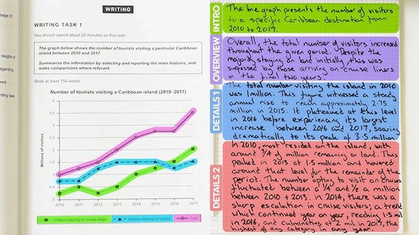
Line Graph
Это график в виде ломаной линии. Он показывает изменение какого-нибудь показателя во времени.
Пример Line Graph:
The line graph below shows the percentage of people using the Internet in three different countries between 2000 and 2020.
Пример задания:
Summarize the information by selecting and reporting the main features, and make comparisons where relevant.
Данные графика:
- USA: 50% (2000), 70% (2005), 85% (2010), 90% (2020)
- UK: 40% (2000), 65% (2005), 80% (2010), 85% (2020)
- Australia: 30% (2000), 60% (2005), 75% (2010), 95% (2020)
Пример ответа:
The line graph illustrates the percentage of Internet users in the USA, UK, and Australia between 2000 and 2020. In all three countries, there was a steady increase in Internet usage over the 20-year period. By 2020, Australia had the highest percentage of users (95%), while the UK had the lowest (85%). The USA experienced a rapid rise in Internet usage in the early 2000s, reaching 90% by 2020.
Pie Chart
Это круговая диаграмма. Она показывает пропорции или проценты от целого.
Пример Pie Chart:
The pie chart below shows the distribution of household expenses in a country in 2020.
Пример задания:
Summarize the information by selecting and reporting the main features, and make comparisons where relevant.
Данные диаграммы:
- Housing: 35%
- Food: 25%
- Transport: 15%
- Entertainment: 10%
- Other: 15%
Пример ответа:
The pie chart represents the distribution of household expenses in a country in 2020. The largest portion of spending was on housing, which accounted for 35%, followed by food at 25%. Transport and other expenses each represented 15%, while only 10% was spent on entertainment. Overall, housing and food were the two largest categories of household spending.
Table
Таблица – она и есть таблица. Это структура, в которой представлены данные различного формата.
Пример Table:
The table below shows the average annual income of different professions in a particular country in 2019.
Пример задания:
Summarize the information by selecting and reporting the main features, and make comparisons where relevant.
|
Profession |
Average Income (USD) |
|
Doctor |
80,000 |
|
Teacher |
40,000 |
|
Engineer |
60,000 |
|
Nurse |
45,000 |
|
Lawyer |
75,000 |
Пример ответа:
The table shows the average annual income of five professions in 2019. Doctors earned the highest income at $80,000 per year, closely followed by lawyers with $75,000. Engineers and nurses had incomes of $60,000 and $45,000, respectively, while teachers earned the least, with an average income of $40,000. Overall, medical and legal professionals were the highest earners, while education professionals earned the lowest.
Process Diagram
Диаграмма процесса обычно показывает, как что-то работает или делается в несколько этапов.
Пример Process Diagram
The diagram below shows the process of recycling plastic bottles.
Пример задания:
Summarize the information by selecting and reporting the main features, and make comparisons where relevant.
Данные диаграммы:
- Collection of plastic bottles from recycling bins.
- Bottles are sorted and cleaned at a recycling plant.
- Shredding the bottles into small pieces.
- Heating the plastic to form new material.
- Molding the plastic into new bottles or products.
Пример ответа:
The diagram illustrates the process of recycling plastic bottles, which involves five main steps. First, plastic bottles are collected from recycling bins and transported to a recycling plant where they are sorted and cleaned. Next, the bottles are shredded into small pieces before being heated to form new plastic material. Finally, this material is molded into new bottles or other products.
Map
Карта ждёт, что вы будете сравнивать места, их изменения с течением времени или планировать грядущее развитие.
Пример Map
The maps below show the changes to a town over a 20-year period.
Пример задания:
Summarize the information by selecting and reporting the main features, and make comparisons where relevant.
Пример описания данных карты:
In 1990, the town had a small residential area in the north and a park in the center. By 2010, the residential area had expanded to cover the west, and a shopping mall replaced the park. New roads were also constructed to accommodate the growing population.
Пример ответа:
The maps illustrate changes to a town between 1990 and 2010. Over the 20-year period, the town underwent significant development. In 1990, a small residential area was located in the north, with a park in the center. By 2010, the residential area had expanded westward, and the park had been replaced by a shopping mall. Additionally, new roads were built to support the larger population.
Combination of Charts
Это последний, седьмой вариант Task 1 Academic, с которым вы можете столкнуться на экзамене. Ничего особенного, просто вам предложат сочетание описанных выше типов и попросят их сопоставить.
Например:
The bar chart below shows the average working hours per week for different professions, and the pie chart shows the proportion of male and female employees in each profession.
Пример задания:
Summarize the information by selecting and reporting the main features, and make comparisons where relevant.
Пример ответа:
The bar chart shows the average working hours per week in various professions, while the pie chart illustrates the proportion of male and female workers in those professions. Doctors worked the longest hours, averaging 50 hours per week, while teachers worked the shortest, at 35 hours per week. The pie chart reveals that the majority of nurses were female, whereas the majority of engineers were male.
Продолжение следует…


Write a comment